

Website Redesign Case Study: Speed, UX & More Conversions
A website can look complete and still fail to deliver results.
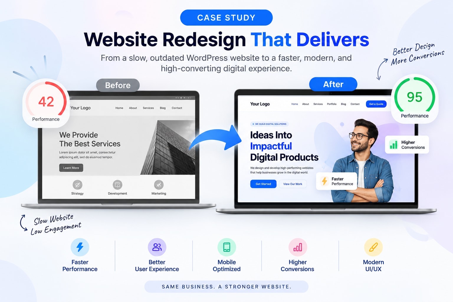
This is exactly what happened with one of our clients. The business already had a website built on WordPress, but despite having the right services and information, the website was not bringing the expected number of customer enquiries.
The client was frustrated. The website was slow, visitors were not spending enough time on important pages, and potential customers were dropping off before contacting the business.
When the client approached our team, the requirement was simple:
“I want my website to be fast, professional, easy to use, and capable of bringing customers.”
Instead of simply redesigning the website, our team first focused on understanding why the existing website was not performing well.
The Client Was Already Struggling With the Existing Website
The website had been developed on WordPress and had been live for some time.
However, as the website grew, different elements, plugins, images, scripts, and content had been added over time. This gradually affected its overall performance.
The client was facing several issues:
Website was loading very slowly
Mobile experience was not smooth
Visitors were leaving before exploring the website
Navigation was not clear
Important information was difficult to find
Call-to-action buttons were not positioned properly
The design looked outdated
Pages contained too much unnecessary information
Customer enquiries were lower than expected
The biggest problem was that the website was technically present online, but it wasn't effectively supporting the business.
The Client Had Already Tried Getting the Website Fixed
Before approaching our team, the client had already spent time and money getting the website developed and modified.
However, the approach was mainly focused on completing the website rather than understanding the complete user journey.
This is where the project became different for our team.
We didn't want to simply take the existing website and change its colors, images, or layout.
We wanted to understand the actual problems first.
Our team explained to the client that website redesign is not just about making a website look modern.
It is about making the website easier to use, faster to navigate, clearer to understand, and better at converting visitors into potential customers.
Our First Step Was a Complete Website Audit
Before starting the redesign, we performed a detailed review of the existing website.
We looked at the website from both a technical and user perspective.
Our audit covered:
Website performance
Page structure
Mobile responsiveness
Navigation
User experience
Content placement
CTA positioning
Images and media
Forms
Technical elements
Conversion journey
This gave us a clear picture of what was working and what needed to change.
The Biggest Problem: A Slow Website
One of the first issues we identified was website speed.
The website had a noticeable loading delay, especially on mobile devices.
For a visitor, this creates a very simple problem.
They click a page.
They wait.
They wait again.
And eventually, they leave.
A business may have excellent services, competitive pricing, and experienced professionals, but if the website doesn't respond quickly, the visitor may never get the opportunity to discover any of it.
Our goal was therefore not just to make the website technically faster, but to create a fast and seamless browsing experience.
From Waiting for Pages to a Smooth Experience
The difference after optimization was immediately noticeable.
Previously, users experienced visible delays while opening pages and moving through the website.
After optimization, pages opened much faster and navigation became significantly smoother.
The experience changed from:
Click → Wait → Page Loads
to:
Click → Page Opens → Continue Browsing
This may sound like a small improvement, but it can have a major impact on how users perceive a business.
A fast website feels more professional, reliable, and easier to use.
We Didn't Stop at Speed Optimization
While improving performance was important, our team quickly realized that speed alone would not solve the client's conversion problem.
The website also needed a better user experience.
A fast website with confusing navigation is still a frustrating website.
So, we moved to the next stage: UX improvement.
Rebuilding the User Journey
We studied how a potential customer would interact with the website.
We asked some basic but important questions:
What does the visitor see first?
Can they understand the business immediately?
Can they find the required service easily?
Is there enough information to build trust?
Is the next step obvious?
Can they contact the business without unnecessary effort?
The answers helped us restructure the website around the customer's journey.
The new journey was designed around:
Understand → Explore → Trust → Contact
Instead of making visitors search for information, we brought the most important information closer to them.
A Cleaner and More Modern UI
The visual design was also redesigned.
The objective wasn't to make the website unnecessarily flashy.
We wanted it to look professional while keeping the experience simple.
The redesigned interface focused on:
Clean layouts
Better typography
Consistent spacing
Clear section hierarchy
Better use of visuals
Easy-to-read content
Stronger CTA placement
Responsive design
Every section had a purpose.
Instead of asking, “How can we make this section look attractive?”, we asked:
“How does this section help the visitor?”
That change in approach made a significant difference.
Making the Website Easier to Navigate
The previous navigation contained too many options and did not provide a clear path for users.
We simplified the navigation and grouped information logically.
Important services were made easier to access, while secondary information was moved to appropriate sections.
This reduced the number of unnecessary clicks required to find important information.
A visitor should not have to explore five different pages just to understand what a company actually offers.
Improving the Call-to-Action Strategy
Another important issue was the lack of strong and strategically placed CTAs.
The website had contact options, but they were not always presented at the right stage of the customer journey.
Our team introduced clear calls to action such as:
Get a Free Consultation
Discuss Your Project
Request a Quote
Talk to Our Team
These CTAs were positioned naturally throughout the website based on the content and user intent.
The objective was simple:
When a visitor is ready to take action, the website should make that action obvious.
Optimizing the Mobile Experience
A large portion of the website traffic was coming from smartphones.
However, the previous website was not providing a smooth mobile experience.
Some sections were difficult to navigate, certain elements didn't adapt properly, and the overall experience felt heavier on smaller screens.
Our team redesigned the website with responsive behavior in mind.
We improved:
Mobile navigation
Button sizes
Content spacing
Image scaling
Typography
Forms
Section layouts
Touch interactions
The result was a much smoother experience for mobile visitors.
Improving Website Content
UX isn't only about buttons and layouts.
Content also plays an important role.
The existing website contained useful information, but it wasn't always presented in the easiest way for visitors to understand.
We reorganized the content into clear sections.
Instead of large blocks of text, information was broken down into smaller, meaningful sections.
The new structure helped visitors quickly understand:
What the company does
What services it provides
How it can help
Why customers should trust it
What the next step should be
This made the website easier to scan and understand.
Adding Elements That Build Trust
When someone visits a service-based business website, they usually have questions before making an enquiry.
“Is this company experienced?”
“Can they handle my project?”
“Have they worked with businesses like mine?”
“Can I trust them?”
To address these questions, we improved the placement of trust-building elements.
Depending on the page, these included:
Client testimonials
Portfolio sections
Case studies
Business information
Service expertise
FAQs
Clear contact information
These elements helped reduce uncertainty and made the website feel more credible.
Technical Optimization Along With Design
One of the biggest mistakes in website redesign projects is focusing entirely on the frontend.
A beautiful interface cannot compensate for poor technical performance.
Our development team therefore worked on the technical side as well.
The optimization included:
Image compression and optimization
Removal of unnecessary website elements
Script optimization
Better asset management
Improved caching
Cleaner page structure
Responsive optimization
Performance improvements
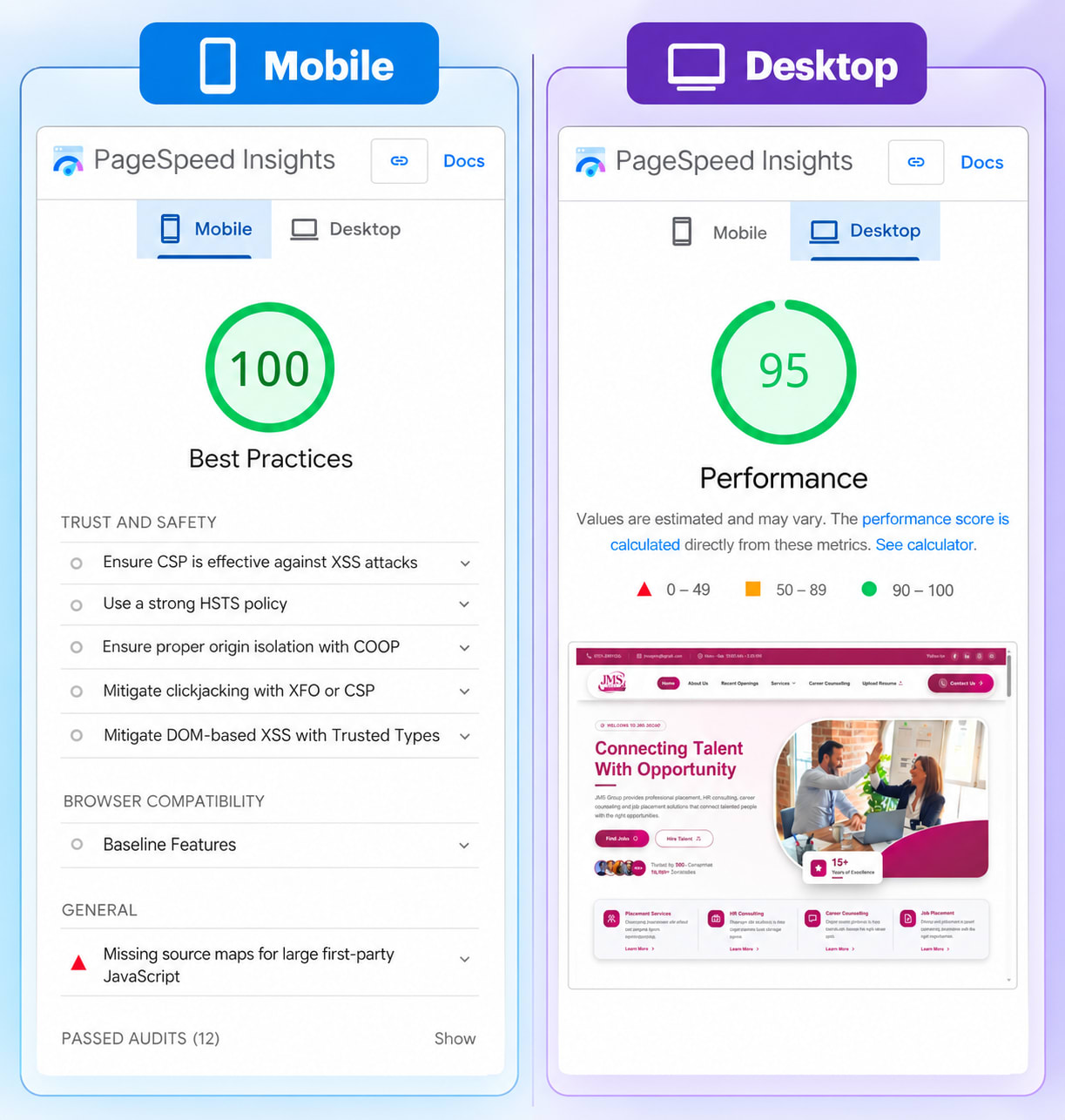
The objective was to ensure that the new website looked better and performed better.
The Results
After the redesigned website was launched, we started monitoring its performance.
The changes were visible not only in the website's appearance but also in user behavior.
The website became faster, navigation became smoother, and visitors were able to reach important information more easily.
The project delivered improvements across several key areas:
| Metric | Before | After |
|---|---|---|
| Website Experience | Slow & Delayed | Fast & Smooth |
| Page Load Experience | Noticeable Waiting | Near-Instant Response |
| Mobile UX | Difficult | Optimized |
| Navigation | Complex | Simplified |
| Conversion Rate | 1.1% | 2.3% |
| Monthly Enquiries | 110 | 240+ |
The biggest achievement wasn't simply changing the website's appearance.
The website started functioning as a better customer acquisition channel.
Yes we are talking about the JMS Groups
What Made This Website Redesign Successful?
There wasn't one single change responsible for the improvement.
The results came from combining multiple improvements.
1. We Identified the Real Problems
Instead of immediately starting development, we first understood what was affecting the website.
2. We Focused on Users
Every major design decision was evaluated from the visitor's perspective.
3. We Improved Performance
The website was optimized to provide a faster and smoother browsing experience.
4. We Simplified the Customer Journey
Visitors could understand the business and take action with fewer unnecessary steps.
5. We Improved Mobile UX
The website was designed to work smoothly across different screen sizes.
6. We Focused on Conversions
The redesign wasn't only about aesthetics. Every important section had a business purpose.
What the Client Gained
By the end of the project, the client didn't simply have a new website.
He had a website that was:
Faster
Easier to navigate
More professional
Mobile-friendly
Better structured
More user-focused
More conversion-oriented
Most importantly, the client now had a website structure that could support future growth instead of constantly requiring fixes and changes.
Final Takeaway
This project showed us an important thing: a website redesign should start with understanding the problem, not with choosing a new design.
The client came to us with a slow WordPress website that was struggling to attract and convert customers.
Our team first analyzed the existing website, explained the problems clearly, and then created a strategy covering UX, UI, performance, mobile responsiveness, content structure, and conversion optimization.
The result was a website that didn't just look better—it worked better.
A successful website should make things easier for both the business and its customers.
When users can quickly find information, navigate comfortably, trust the business, and take action without friction, the website becomes more than a digital brochure.
It becomes a growth tool for the business.